 iRA
Connected car app
A connected-car app drivers had given up on. Rebuilt, screen by screen.
- Client
- Tata Motors, with yuj
- Role
- Led the UX redesign
- Timeline
- 2023
- Method
- Expert review + user testing
- Recognition
 Red Dot Design Award
- Reach
- 500K+ drivers · B2C
The app could lock doors, cool the cabin, find the car. But the reviews kept getting worse. The features weren't the problem. Trust was.
Five places trust was leaking.
- 01No single home
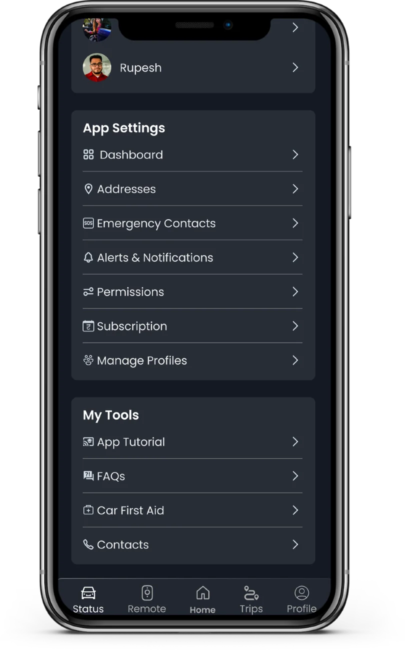
Competitors showed status, commands and trips in one place. iRA scattered them.
- 02Hidden actions
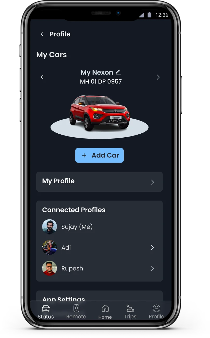
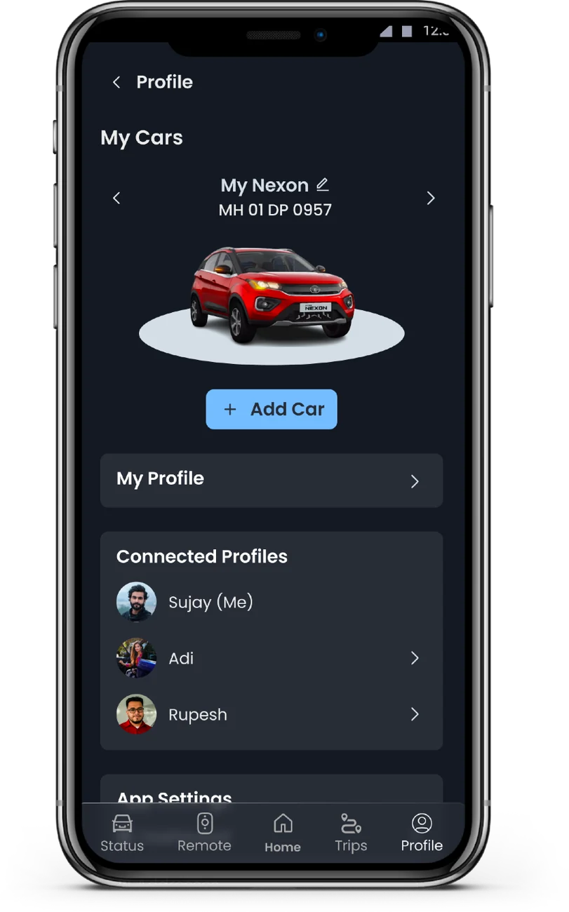
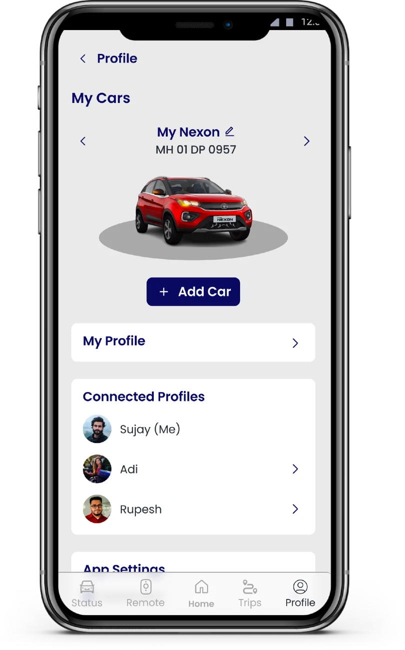
Switching or renaming a car lived deep in a menu with unclear labels.
- 03Wasted space
A big car photo pushed the data drivers actually needed off screen.
- 04Thin information
Subscription plans said little, so people didn't know what they'd paid for.
- 05Which car is which?
Tiny visuals and vague names made two cars hard to tell apart.
One home. Everything in thumb's reach.
- {{n}}
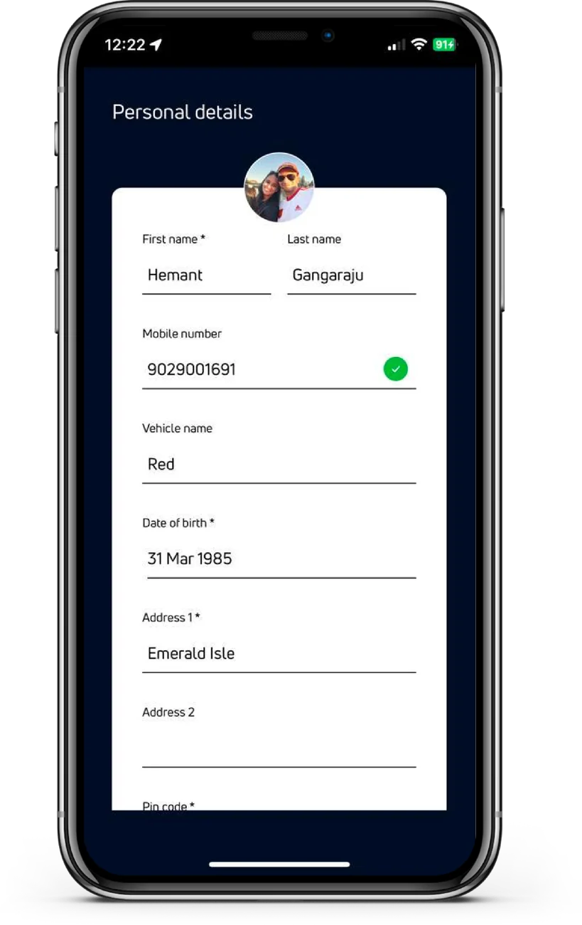
Simplified illustration of the direction, not production screens.
Silence reads as a broken car.
So every command shows it's sending, then confirms it reached the car. Try it.
{{status}}
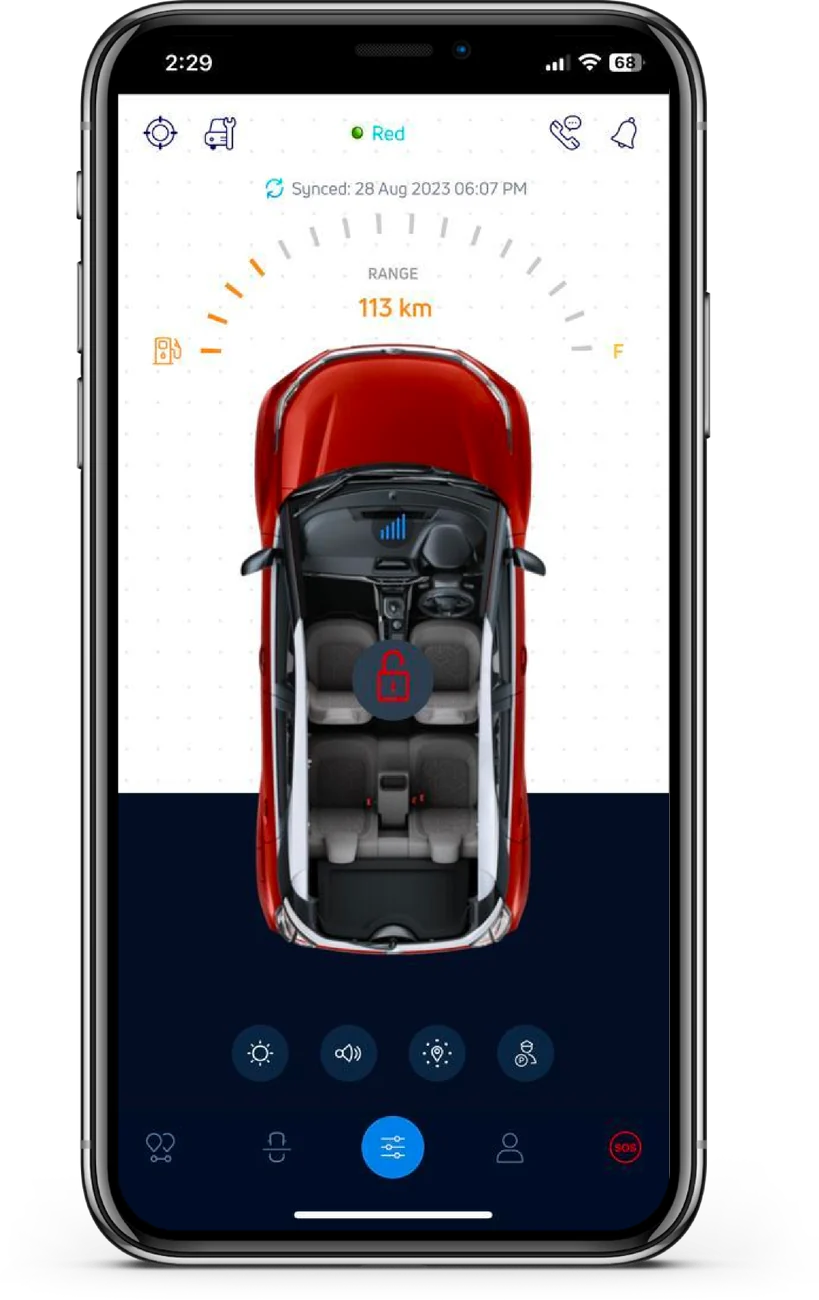
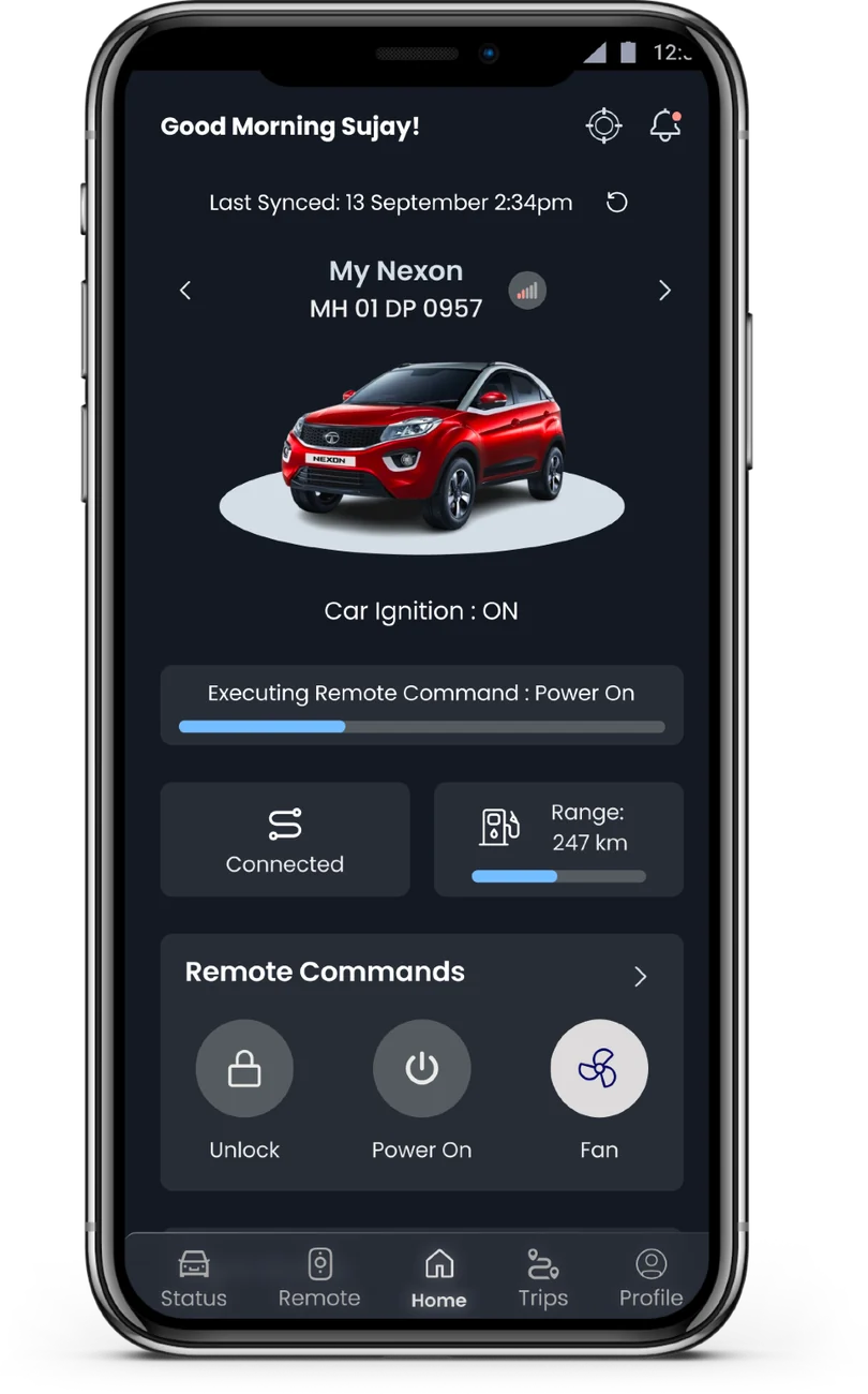
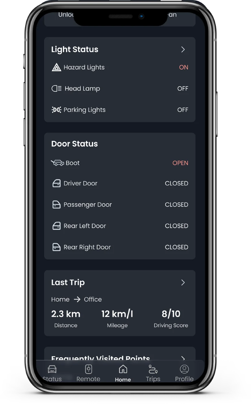
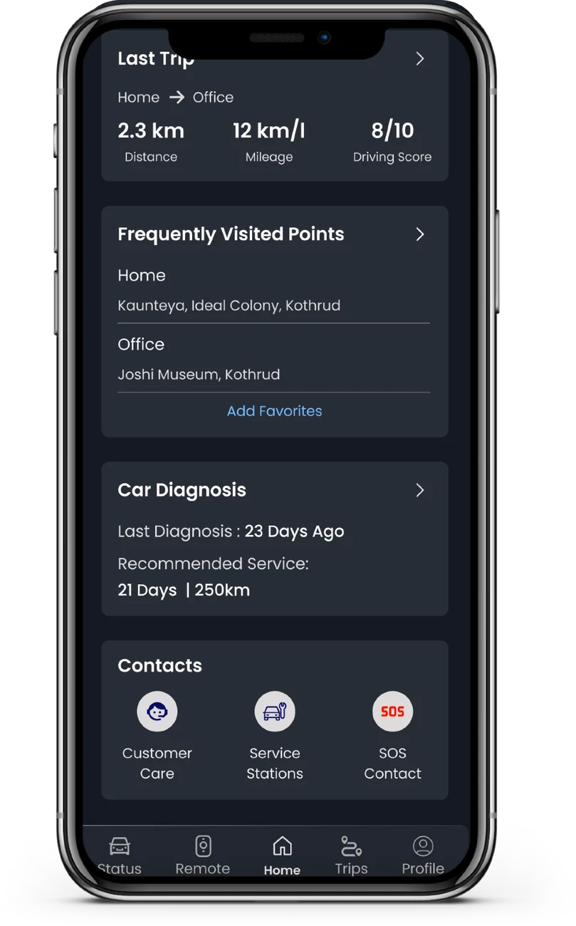
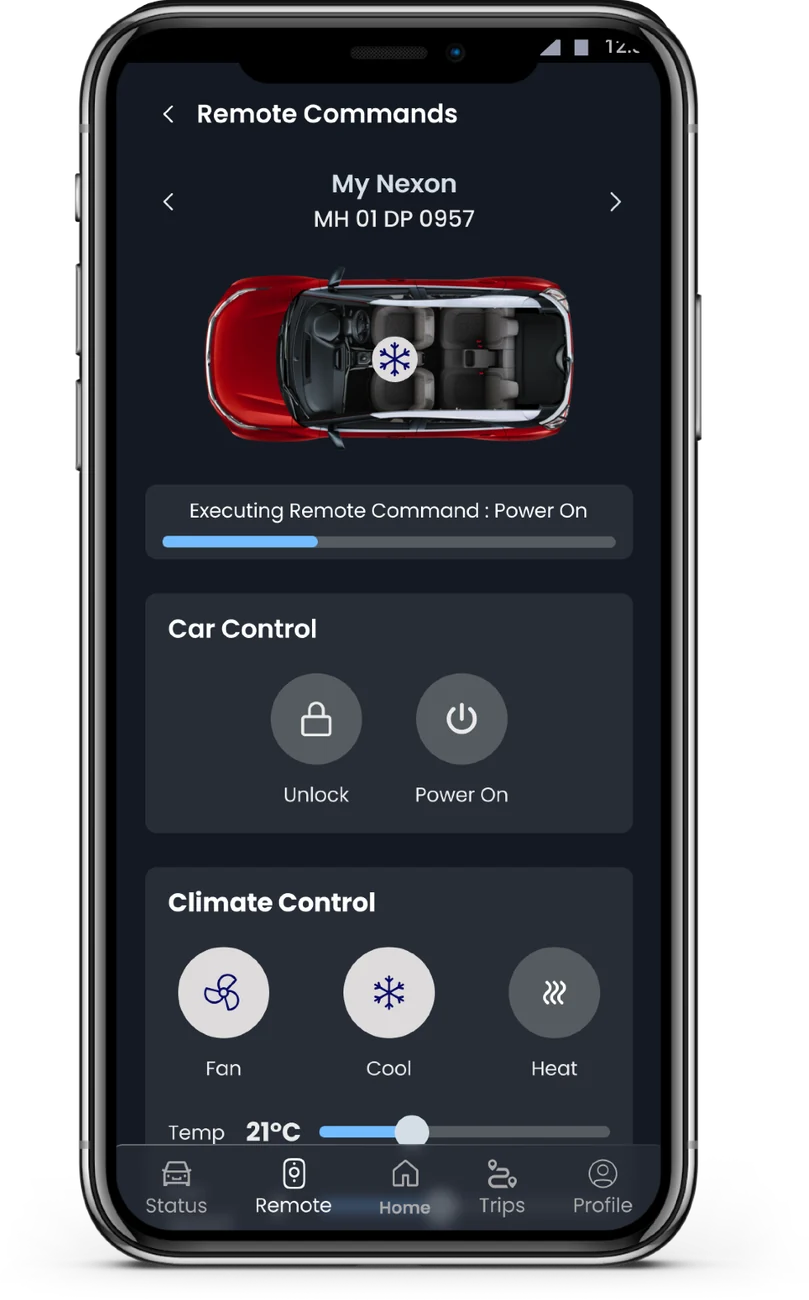
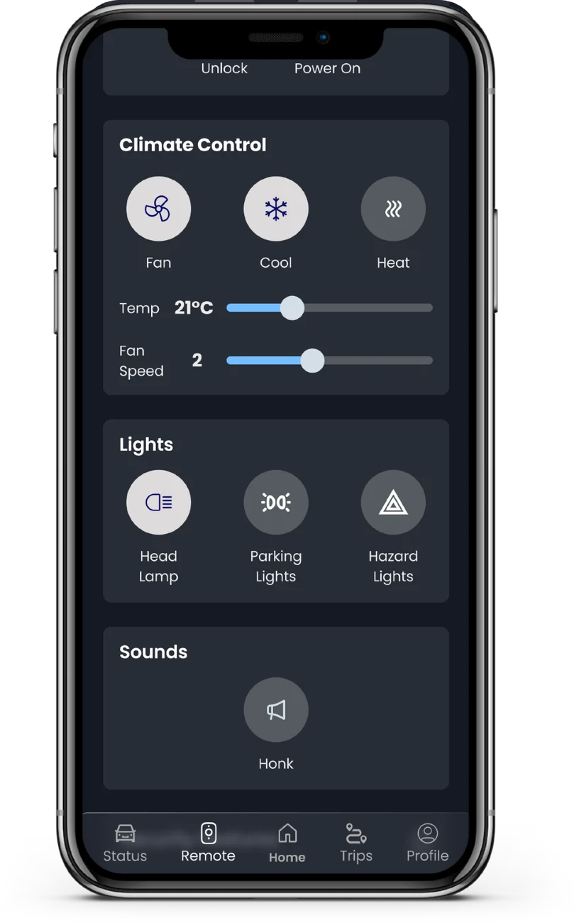
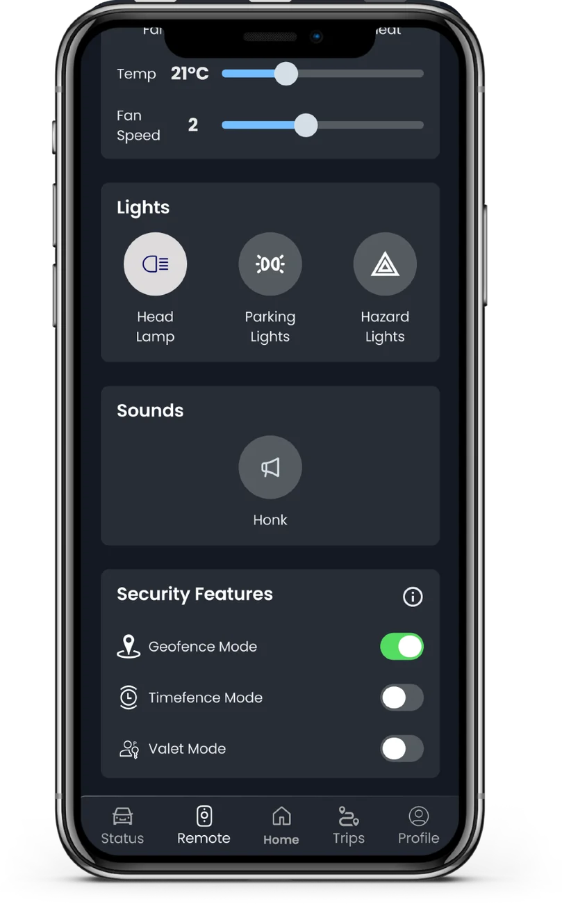
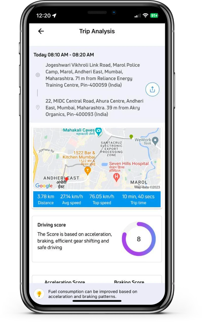
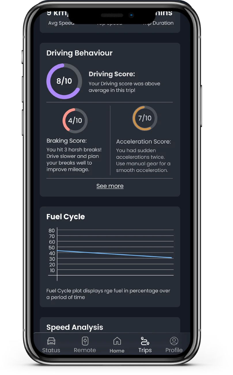
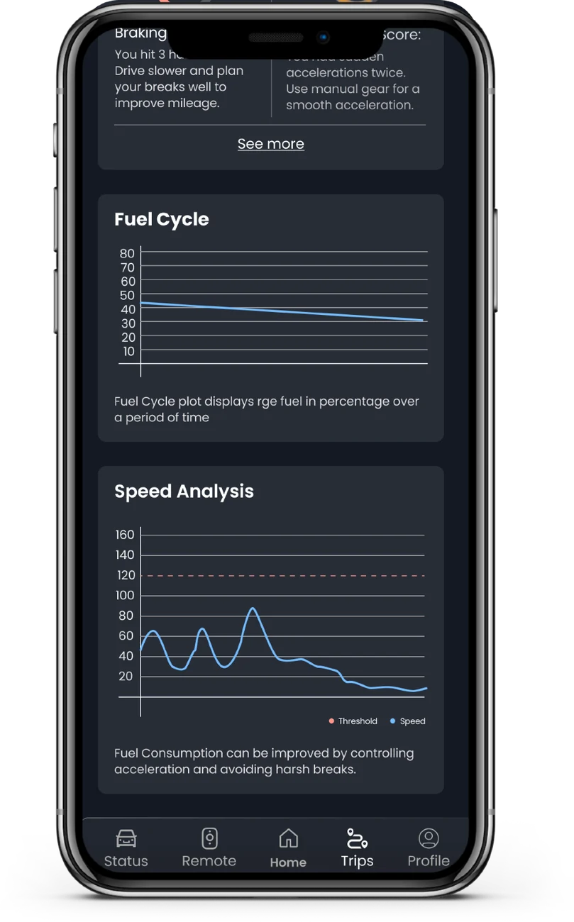
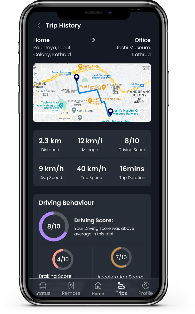
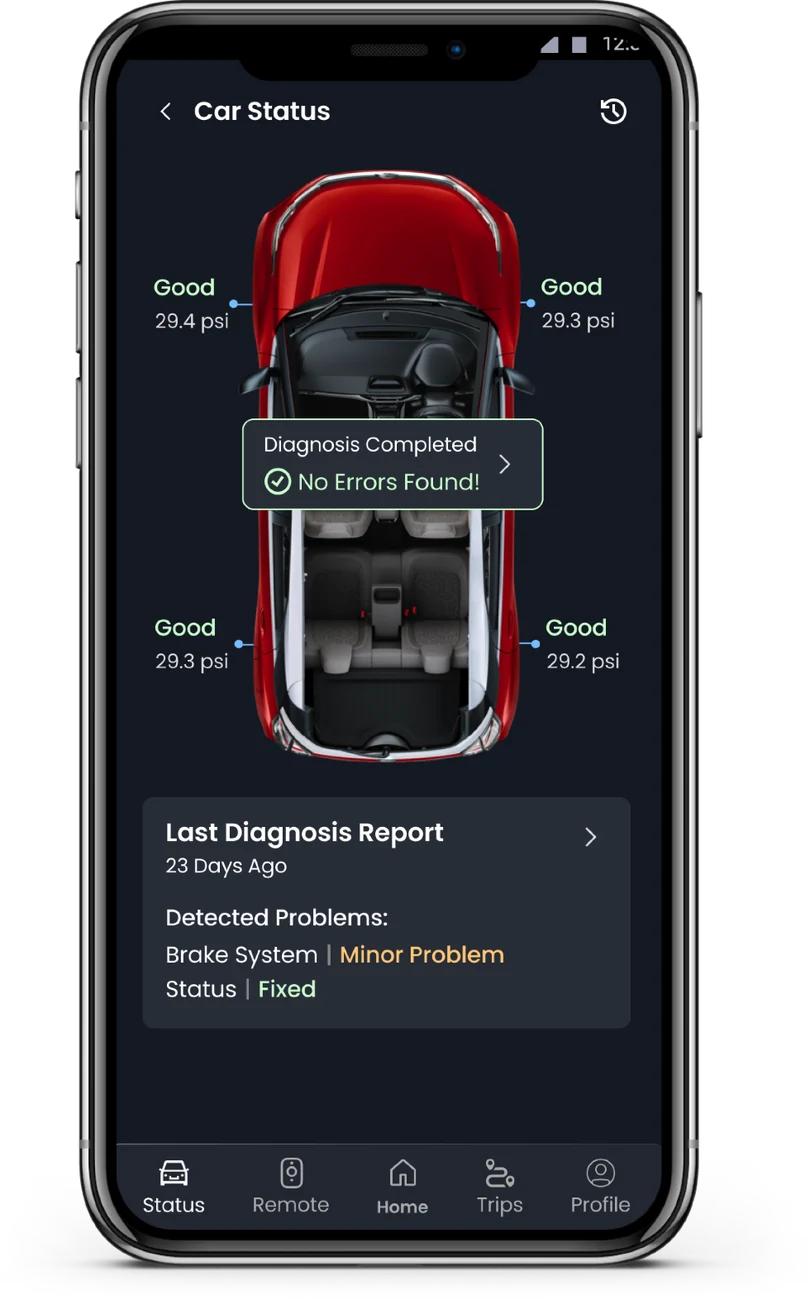
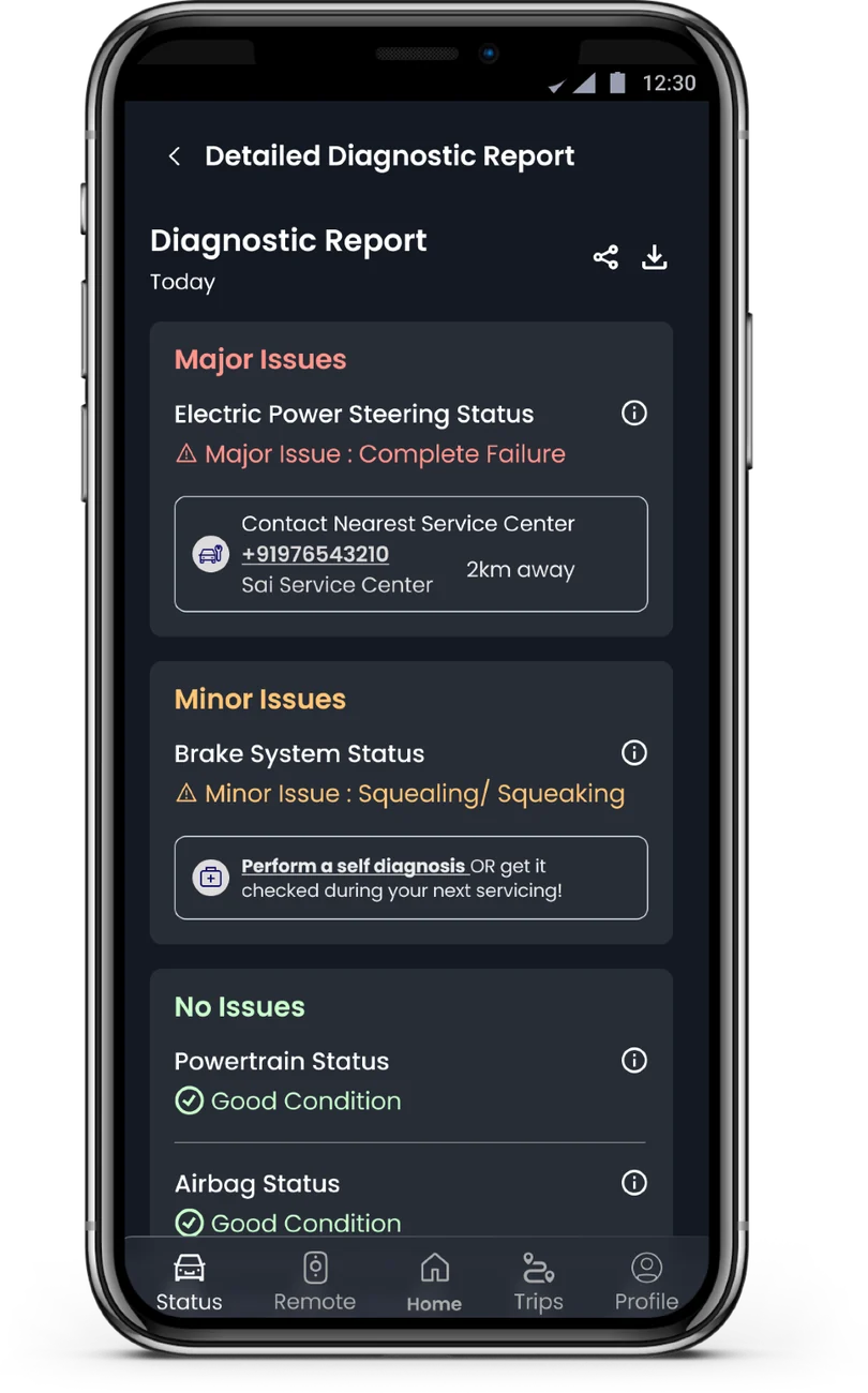
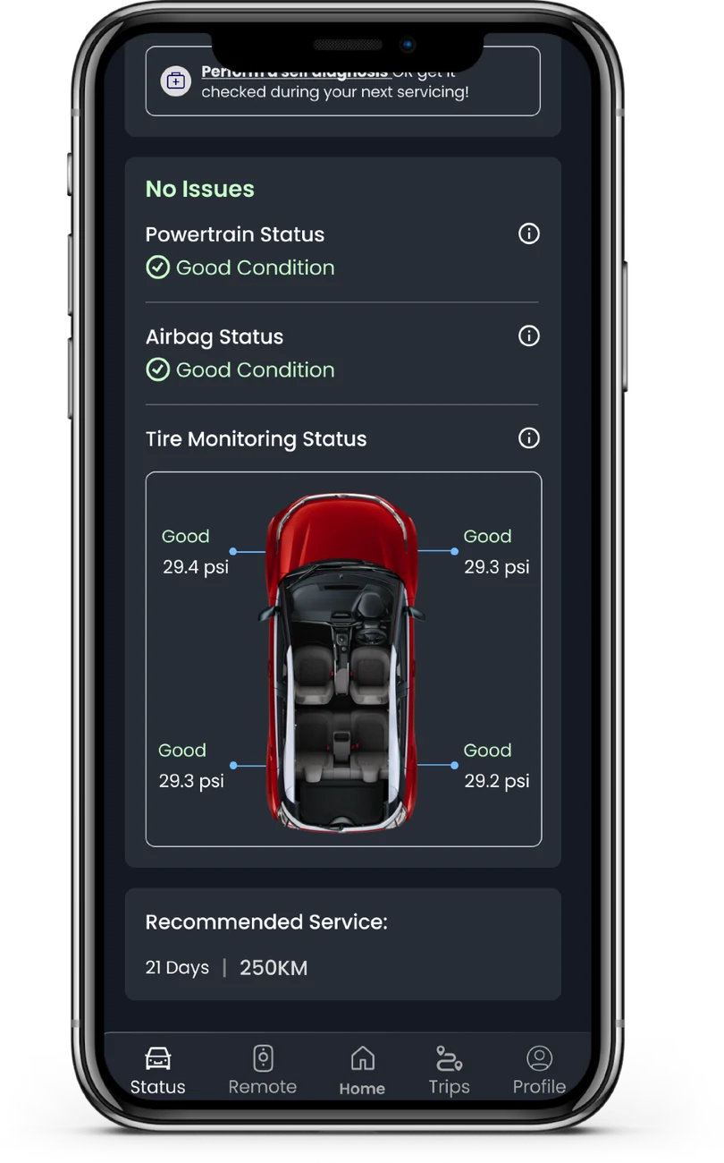
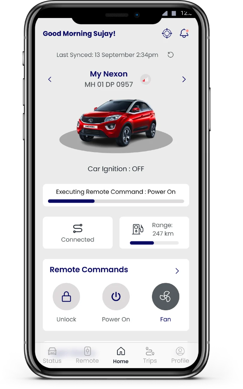
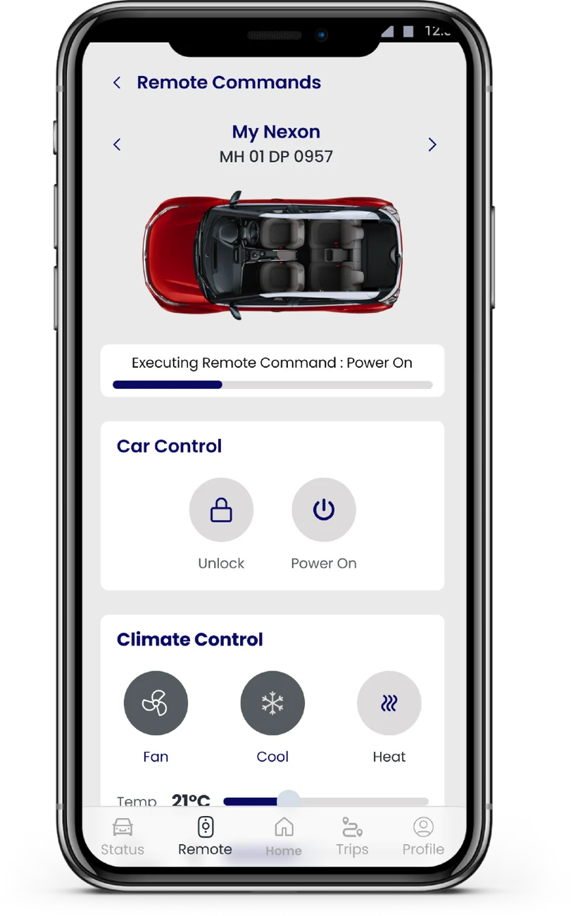
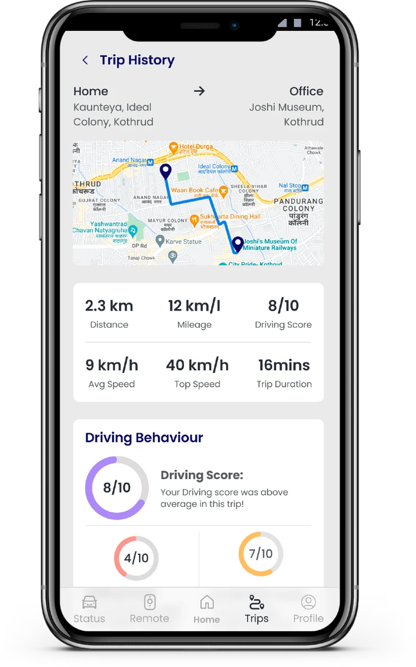
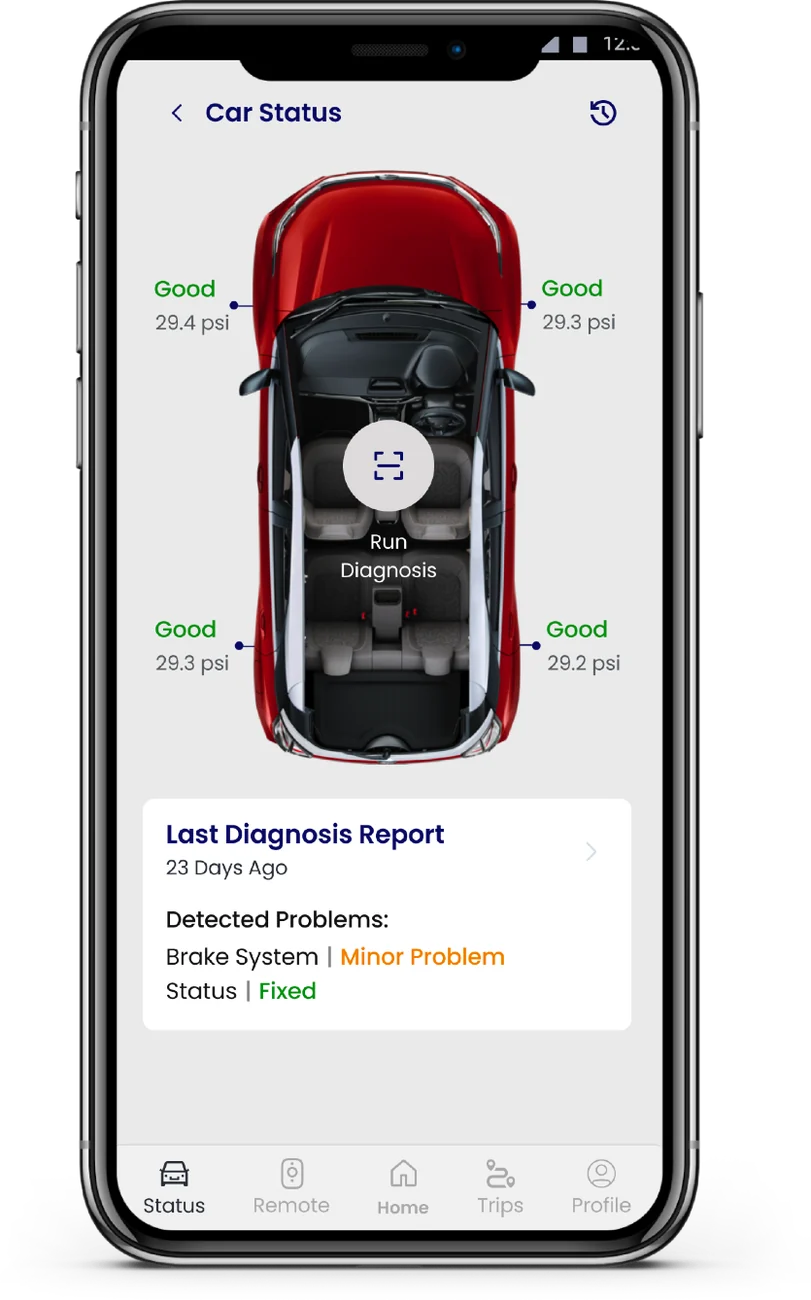
Trust isn't more data on screen. It's instant proof the car heard you.
The impact
task success
drivers
rating on Google Play
Red Dot Design Awardfor the iRA experience